UI REDESIGN

Computer | TV Experience


Role

Lead UI/UX Designer

Company

HULU (Self-Initiated Project)

Project

Interface Redesign

Platforms

Web and TV


Project Overview

Redesign the UI/UX for Computer and Television

In this self-initiated project, I redesigned the user interface for both computer and television platforms to address significant usability challenges. The original interface was inefficient, requiring multiple clicks for simple tasks and lacking intuitive navigation, which negatively impacted the user experience. To improve accessibility and streamline the user journey, I focused on enhancing navigation, simplifying the design, and adding features to improve content discovery. Through a user-centered approach, I introduced a cleaner design layout, reduced the number of clicks required to navigate the system, and added a "You may also like" section to foster greater engagement. This redesign resulted in a more intuitive, efficient, and enjoyable user experience, transforming how users interact with both computer and television interfaces.

The Problem

The original UI for computer and television experiences was outdated, difficult to navigate, and lacked consistency. Users often struggled with finding desired content, interacting with features efficiently, and adapting between different devices. The need for a redesigned interface that aligned with modern UX best practices became clear.

Without practical tools, children struggle to understand the value of money and budgeting. The absence of structured systems for requesting and managing funds from parents hampers their ability to plan and justify financial needs. This deficiency can lead to irresponsible financial behavior and poor decision-making.

The Goal

To simplify and improve the user interface by reducing the number of clicks required to perform tasks, enhancing navigation clarity, and introducing a more intuitive and visually appealing layout. The goal was to create a cleaner design that improved usability across both computer and television platforms while adding features like the "You may also like" section to increase content discovery and user engagement. This redesign aimed to provide a seamless and efficient experience by balancing functionality with a visually cohesive interface.

Responsibilites

  • Conducted competitive analysis to evaluate industry standards and identify best practices for improving user interface design.
  • Conducted research and analysis on user pain points within the existing interface to identify key areas for improvement.
  • Designed a more intuitive navigation system to streamline access to content and features, reducing the number of steps required for users to complete tasks.
  • Simplified the overall design layout to ensure ease of use and better accessibility for both computer and television interfaces.
  • Introduced the "You may also like" section to promote further content discovery, enhancing user engagement.
  • Developed wireframes, mockups, and prototypes to test the new interface design and iterated based on user feedback and usability testing.
  • Worked independently throughout the entire process, from ideation to final implementation, ensuring a cohesive and user-centered solution

User Research

Objective

The primary objective of the user research for this project was to identify pain points in the existing computer and television user interfaces and understand user behaviors and preferences to inform design improvements. The goal was to ensure that the redesigned interface aligned with user needs, providing a more intuitive, efficient, and enjoyable experience.

Research Method

  • User Interviews: Conducted interviews with users from different demographics to gather qualitative insights on their frustrations with the current interface and their expectations for improvement. Focused on identifying recurring issues such as complex navigation and excessive clicks.
  • Usability Testing: Conducted usability tests on the existing interface to observe users as they performed common tasks. This method revealed navigation inefficiencies and uncovered user confusion in accessing specific features.
  • Competitive Analysis: In addition to direct user research, I performed a competitive analysis to benchmark against leading industry standards and evaluate successful navigation patterns and feature implementations from competitors.

Key Findings

  • Navigation Complexity: Users reported frustration with the number of steps required to complete simple tasks. The interface lacked clear pathways for accessing frequently used features.
  • Cluttered Layout: The existing design was perceived as visually overwhelming, which contributed to confusion and decreased engagement.
  • Feature Discovery: Users indicated that discovering additional content, such as recommendations, was challenging, limiting their ability to explore new material.

Insights and Design Implications

  • Streamlining the navigation was essential to reduce clicks and simplify the user journey.
  • A cleaner, less cluttered layout would enhance the user experience by making the interface more approachable and accessible.
  • Introducing a "You may also like" section would improve content discovery, leading to increased engagement with available features.

The findings from this user research directly informed the redesign, ensuring that user feedback was integrated into the navigation, layout, and feature enhancements, resulting in a more user-friendly and intuitive interface.

Starting the Design

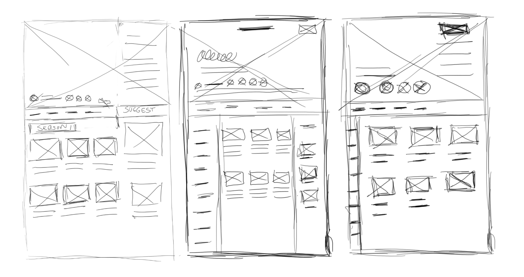
Paper Wireframes

At the initial stage of the design process, I began by sketching paper wireframes to quickly explore different design ideas. These rough, low-fidelity sketches allowed me to visualize various layout options for the computer and television interfaces, focusing on optimizing navigation flow and feature placement. Using paper wireframes helped me rapidly iterate on concepts, gather initial feedback, and determine the best structure for simplifying the user experience. This step also enabled me to experiment with different approaches for the new "You may also like" section and ensure that the interface's overall functionality remained user-friendly and intuitive.

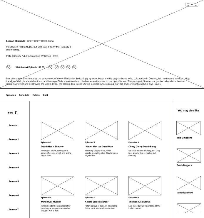
Low-fidelity Prototype

Once the paper wireframes had provided a clear direction, I transitioned to creating low-fidelity digital wireframes. These wireframes maintained simplicity while incorporating essential elements such as navigation menus, content sections, and user interaction points. I focused on refining the layout and ensuring consistency between the computer and television experiences. At this stage, I further simplified the interface by reducing unnecessary steps and ensuring that key features were easily accessible. The low-fi wireframes were used to validate the core structure and navigation flow with potential users, enabling early testing without the distraction of detailed visuals.

Usability Findings

Throughout the wireframing process, I conducted several rounds of usability testing to evaluate how users interacted with the redesigned interface. The findings from these tests provided crucial insights:

  • Improved Navigation: Users found the new navigation system to be significantly more intuitive, with fewer clicks required to reach their desired content. This confirmed the success of the streamlined design.
  • Content Discovery: The "You may also like" section was highly appreciated by users, who felt it enhanced their experience by offering personalized content recommendations, making the interface more engaging.
  • Visual Clarity: Users praised the simplified layout, stating that it made the interface less cluttered and more approachable, especially on television screens, where viewing distance can impact ease of use.
  • Task Efficiency: Overall, the redesigned interface allowed users to complete tasks more efficiently, reducing frustration and increasing satisfaction.

These usability findings were instrumental in guiding further iterations of the wireframes, ensuring that the design not only addressed the initial problems but also exceeded user expectations.

Refining the Design

Mockups

I created high-fidelity mockups based on the wireframes and low-fidelity designs, incorporating detailed visual elements and refining the overall layout. These mockups brought the design to life, ensuring that the final interface not only met user needs but also adhered to a polished and cohesive aesthetic.

Before usability study

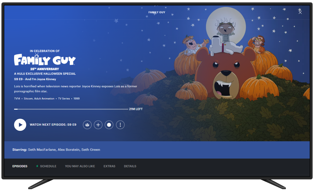
Before the usability study, the layout included hidden buttons, such as the 'like' and 'dislike' options, which users found difficult to locate. Additionally, users had trouble identifying where to find more information about the show, leading to confusion during navigation.

After usability study

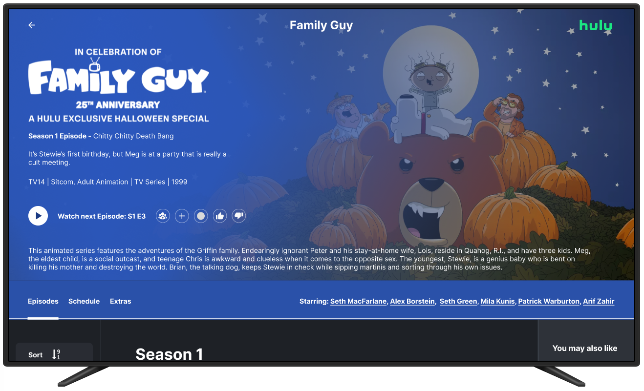
Following the usability study, key adjustments were made to enhance visibility and clarity. The previously hidden "like" and "dislike" buttons were redesigned and repositioned to be more prominent, ensuring users could easily identify and interact with them. Additionally, a clear, accessible call-to-action was added for learning more about a show, simplifying navigation and reducing user confusion. As a result, users were able to quickly engage with content and find additional information with minimal effort, leading to a more intuitive and satisfying experience.

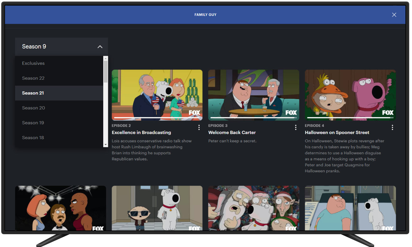
Before usability study

In the episode selection section, I observed that users were frustrated by having to click a dropdown menu to access multiple episodes. Additionally, they expressed dissatisfaction with the navigation that required them to click a button to access the 'You may also like' content.

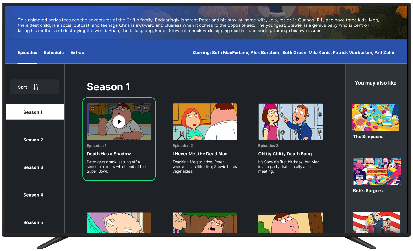
After usability study

To resolve these issues, I removed the unnecessary click for the 'You may also like' section by placing it on the right side of the screen, making it always accessible to users. I also repositioned the seasons to the left side, allowing users constant access to the seasons with the ability to sort through them easily. Additionally, I introduced a clearly defined border around each episode, which became visible when hovered over, providing users with clear visual feedback and enhancing navigation clarity.

High-fidelity Prototype

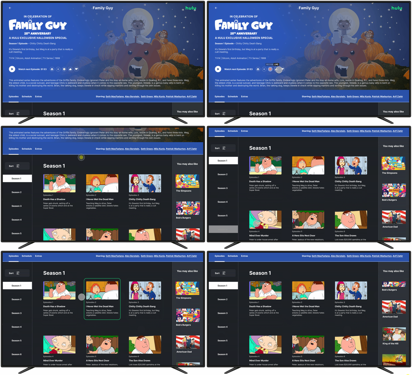
You can view a live demo of the interface by clicking the view prototype button.
Going Forward

Takeaways

Impact

The redesign had a significant impact on improving the overall user experience. By simplifying navigation, making the "You may also like" section always accessible, and enhancing the visibility of episodes and seasons, the user interface became more intuitive and user-friendly. As a result, users were able to interact with content more efficiently, leading to increased engagement and a smoother experience across both the computer and television interfaces. The changes reduced friction in the user journey and encouraged more exploration of available features.

What I learned

This project reinforced the importance of user-centered design and continuous iteration. By closely observing how users interacted with the initial designs, I was able to identify pain points that weren’t immediately apparent in the early stages. I learned the value of testing design assumptions and how small, thoughtful changes—such as improving visibility and reducing unnecessary clicks—can make a big difference in user satisfaction. Additionally, the project highlighted the need to balance functionality with aesthetics, ensuring that both the visual design and the user experience align with the users' needs.

Next Steps

Final User Testing and Validatio

Before moving into development, it’s essential to conduct another round of user testing to validate the final high-fidelity mockups. This testing will ensure that the refinements made after the initial usability studies have effectively addressed all identified issues. By gathering final feedback from a broader user base, any last-minute adjustments can be made to further enhance the design’s usability and overall experience.

Collaboration with Development Team

The next step involves collaborating closely with the development team to ensure a smooth handoff of the high-fidelity mockups. Detailed design specifications and interaction guidelines will be provided to maintain consistency during implementation. Regular check-ins with the development team will be crucial to ensure that the design vision is accurately translated into the final product.

Post-Launch Monitoring and Iteration

Once the design is implemented and launched, it’s important to monitor user interactions and gather real-time data to evaluate how the interface is performing in a live environment. Metrics such as engagement rates, time spent on tasks, and user feedback will be analyzed to identify any further areas of improvement. The design will be iterated as needed based on user feedback and data-driven insights to ensure ongoing optimization of the user experience.